Flight Patterns as a dynamic diagram
Very cool dynamic diagrammings created from data from the US aviation administration. PLEASE check this out!!
Wednesday, November 22, 2006
Monday, November 20, 2006
Mount Fear - Abigail Reynolds
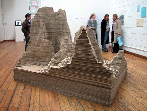

Abigail Reynolds explores the documentation and presentation of information by restructuring them to life-sized, tangible models. One of these is Mount Fear, the artist’s interpretation of police statistics. The series of works is based on the violent crimes committed in urban areas such as Manchester and East London within the time span of one year. The statistics are digitally plotted by a computer programme to form undulating three-dimensional terrains. Reynolds constructs a model of this terrain using Styrofoam and corrugated cardboard, creating a conceptual landscape where each criminal incident adds to the scale of the model: peaks represent high crime levels and valleys are areas of low crime.
The experience of urban life is expressed in the treacherous summits and safe troughs of Reynolds’ sculptural forms. Crime is a grim reality on the city streets, yet Reynolds records it paradoxically by alluding to the language of Romantic landscape painting and the dream of rural escapism. Just as the Romantic poets and painters expressed their sense of awe at the majesty of nature, Reynolds shows a similar sense of wonder at the world of information systems and data. The assumed authority of these data is expressed in the impressive scale of the models. Mount Fear uses statistics to express an unexpected narrative about the urban landscape. In her attempts to pin down dynamic, shifting aspects of social behaviour, Reynolds allows the audience to wonder at the truth of this urban narrative. Statistics are numbers representing facts, and yet they allow ample room for an interpretation of these facts. Reynolds questions the authority of numbers and the ways in which they are exploited, which lends her work a subtle political undertone. For the exhibition at MU Abigail Reynolds will transform the crime rates of several areas in Eindhoven to a new work. This work will be presented at MU together with the London and Manchester sculptures and many drawings.
Abigail Reynolds (1970) is a graduate of the famous Goldsmiths College, where she completed an MA in Fine Art, and Oxford University where she studied English Literature. She lives and works in London and lectures at Chelsea College of Art and Design. Reynolds is principally working with digital media. Her interest in the recording and configuration of information is continued in her current role as artist-in-residence at the reputed Oxford English Dictionary where she is tracking the impact of Britain’s colonial past on the English language. Abigail Reynolds exhibited before in London, Zurich, Helsinki, Vienna and Toronto.
Some more from the web about her:
http://www.abigailreynolds.com/news/newsindex.html
Friday, November 17, 2006
Data Artist

Visualization is an important technique in communication our mind. What is envisioning a concept? From quantifing information to anaylsis them as a stratgy of concpet thinking. Edward Tufte is a professor at Yale University, where he teaches courses in statistical evidence and information design. His books include Visual Explanations, Envisioning Information, The Visual Display of Quantitative Information, Political Control of the Economy, Data Analysis for Politics and Policy, and Size and Democracy (with Robert A. Dahl). He is a fellow of the American Statistical Association, the American Academy of Arts and Sciences, the Guggenheim Foundation, and the Center for Advanced Study in the Behavioral Sciences. He has received honorary doctorates from The Cooper Union and Connecticut College, the Phi Beta Kappa Award in Science, and the Joseph T. Rigo Award for contributions to software documentation from the Association for Computing Machinery. Do check it out his website.
http://www.edwardtufte.com/tufte/index
Thursday, November 16, 2006
How are WE feeling today??
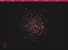
 This is an interesting website I found today, that maps and displays "feelings" posted on the internet. It might help those of you (nihal?) who are considering mechanisms which deal with mood/emotion. check it out:
http://www.wefeelfine.org
"We Feel Fine is an exploration of human emotion on a global scale.
Since August 2005, We Feel Fine has been harvesting human feelings from a large number of weblogs. Every few minutes, the system searches the world's newly posted blog entries for occurrences of the phrases "I feel" and "I am feeling". When it finds such a phrase, it records the full sentence, up to the period, and identifies the "feeling" expressed in that sentence (e.g. sad, happy, depressed, etc.). Because blogs are structured in largely standard ways, the age, gender, and geographical location of the author can often be extracted and saved along with the sentence, as can the local weather conditions at the time the sentence was written. All of this information is saved.
The result is a database of several million human feelings, increasing by 15,000 - 20,000 new feelings per day. Using a series of playful interfaces, the feelings can be searched and sorted across a number of demographic slices, offering responses to specific questions like: do Europeans feel sad more often than Americans? Do women feel fat more often than men? Does rainy weather affect how we feel? What are the most representative feelings of female New Yorkers in their 20s? What do people feel right now in Baghdad? What were people feeling on Valentine's Day? Which are the happiest cities in the world? The saddest? And so on.
The interface to this data is a self-organizing particle system, where each particle represents a single feeling posted by a single individual. The particles' properties – color, size, shape, opacity – indicate the nature of the feeling inside, and any particle can be clicked to reveal the full sentence or photograph it contains. The particles careen wildly around the screen until asked to self-organize along any number of axes, expressing various pictures of human emotion. We Feel Fine paints these pictures in six formal movements titled: Madness, Murmurs, Montage, Mobs, Metrics, and Mounds.At its core, We Feel Fine is an artwork authored by everyone. It will grow and change as we grow and change, reflecting what's on our blogs, what's in our hearts, what's in our minds. We hope it makes the world seem a little smaller, and we hope it helps people see beauty in the everyday ups and downs of life."
Canary Wharf: Hi-Tech Wilderness

London's Canary Wharf business district is in many ways an undeveloped development. As an address and physical location for grand-scale office developments it is an effective and well constructed machine. As a human environment however, it is uninviting and seems insensitive to the modifying touch of its many daily users.
I am interested particularly in Montgomery Square; a bleak, largely grey space to the east of Jubilee Gardens, between the Clifford Chance and BP/McGraw Hill buildings.
Currently the square is windswept and forgotten, used only as a circulation route.
As such it epitomises the less lovable traits of the development; people pass through on their way to somewhere else, never ever lingering to enjoy the space itself.
Around Canary Wharf there are half a dozen sculptures. Though they vary in style, all are abstractions of the human form, as if the environment is only habitable to beings of metal and stone. Inside the skyscrapers and office blocks meanwhile, real people operate in carefully controlled comfort; their climates controllable at the touch of a mouse or keyboard.
This contradiction is fascinating. Why must a modern, technologically exacting development be so faceless? This question can be answered to a degree through considerations of efficiency, but not wholly. After all, there are areas such as Montgomery Square with no apparent reason for remaining undeveloped.
This square would benefit enormously were the Ambient Intelligent technologies coursing through the areas' buildings and airwaves utilised to create a public space appropriate and beneficial to the environment surrounding it; A demonstration that AmI's are essentially human technologies created by and for humans, not something debilitating to the human spirit.
Monday, November 13, 2006
Bored? When you are waiting??

What does a bus station mean? What is the purpose of a bus station? Can we bring a new meaning to a bus station?
These questions I have been asking myself for the past week.
The site is London Victoria Bullied Way, Greenline Coach Station as seen on the photo.
I have chosen this site because of my personal experience. I have travelled myself long journeys by buses and have waited several hours till the bus arrives. This is an open air bus station so nowadays during the upcoming winter period it gets cold. There are some coffee shops and eating places around but what if you dont want to wait inside or you find yourself without money. There are no announcements so if difficult to know when and where from the buses are leaving. You can find some seats which you can use but are uncomfortable for longer period.
Imagine youself waiting for a bus. To pass on the time you read a book or listen to music but what if you don't have any of these things. The time turns into a very slow pace factor and you start to seek for some kind of change than just looking around and day dreaming.
My proposal wants to introduce ambient intelligence to tackle these problems of the site and change them into more habitable environment. An environment where are elements which help you to change the experience of waiting. I want to try to make people think of a bus station differently.
I understand that bus stations are not made for waiting long periods of time but why does it have to be unpleasant experience. It's about creating new oppurtunities and options.
From some people a bus station is an end destination to their journey but for some it is the start.
Subscribe to:
Posts (Atom)
